New UX Theme
We’ve been working on a new, calmer UX Theme for a while.
The aim is to reduce the number of lines, have less visual clutter, better demarcation of boundaries, consistent colour use across all tools, and to make everything just a bit simpler and calmer to look at.
The best way to show you these changes to show before and after images of each change.
Dialog Titles
Before: Sections are indicated by text with a horizontal line next to it.
After: Sections are indicated by bold text in Software Verify blue with no horizontal line.
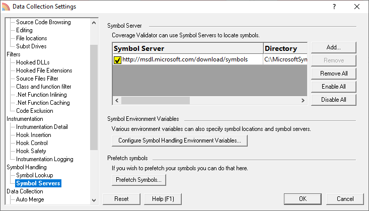
Settings grids
Before: Vertical and horizontal grid lines are part of the display.
After: Vertical and horizontal grid lines are minimised with the boundaries between adjacent lines indicated by a subtle change of background colour.
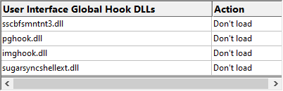
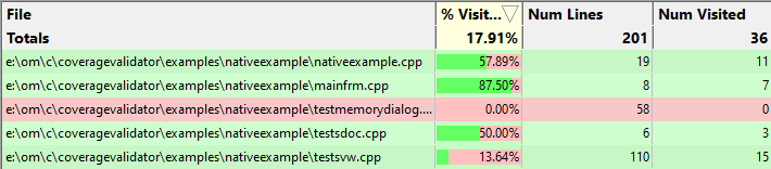
Data grids
Before: Vertical and horizontal grid lines are part of the display.
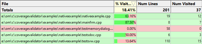
After: Horizontal grid lines are minimised with the boundaries between adjacent lines indicated by a subtle change of background colour. Vertical grid lines are present, but very subtle so as not to intrude on the display.
Grid highlighting
Before: There was no automatic grid highlighting.
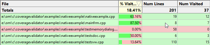
After: When you move the mouse over a grid the line under the mouse automatically highlights in light blue. This can be very useful on wide grids with many columns.
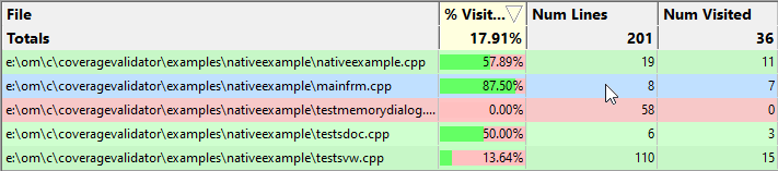
The grid highlighting functionality does not change which items are selected in the grid. It is purely a visual aid. The grid highlighting works for both data grids and settings grids.
Tab Headings
Before: Tabs were displayed with the current tab in bold.
After: Tabs are displayed with all tabs in Software Verify blue and the current tab is bold with the orange highlight colour.
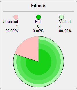
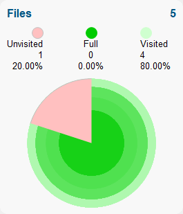
Graphics – Circles
Before: Circles were displayed with outlines and pie section separators.
After: Circles are displayed without outlines and with no pie section separators.
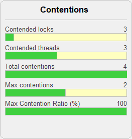
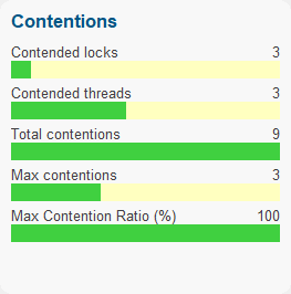
Graphics – Bars
Before: Bars were displayed with outlines.
After: Bars are displayed without outlines.
Splitter Windows
Before: The splitter and the edges of the window were highlighted.
After: The splitter is highlighted. The edges are not highlighted.
Toolbar and menu icons
Before: Our previous icon set was 3D and looked a bit tired.
After: The new icon set is flat and uses the Software Verify colour palette.
Conclusion
These changes in isolation probably don’t look like much, but when you see them all together it makes for a more pleasant experience. The effect is magnified when you’re looking at a lot of data – having less clutter. It’s a subtle but important thing.
These changes will be rolled out across all our tools, both free and commercial, in the weeks following 8 December 2020.
Customers that have purchased tools and that have valid software maintenance will be emailed when software updates containing these changes are available for them to download.